Intersecting, Overlapping Hierarchies
Nancy Folbre
20 January 2019Playing around with visual images to convey the concept of intersecting

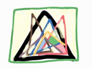
I have been playing around for some time with visual images to convey the concept of intersecting, overlapping hierarchies based on dimensions of group identity such as gender, race/ethnicity, class, and citizenship. For a while I liked fractal pyramids because sometimes inequalities do seem nested inside one another. But I turned against them because a) they seem too regular, too geometric, too deterministic, and b) they imply that some inequalities fully enclose others. Then I played around with 3-dimensional pyramids with N facets (and a polygonal base with N sides) where each facet represented membership in a socially assigned group.
This was kind of neat, because I could use each facet to show the distribution of income or wealth and show how women, people of color, wage earners, and non-citizens of the U.S. were arrayed from top to bottom. I actually invested some time and money into this income mapping project, but then decided it was too complicated.
Part of the problem was that the pyramid of income in the U.S.–if accurately portrayed in terms of distance between groups–looks very weird, with a kind of flagpole on top representing the vast range of incomes in the top 5%.
In late December, while doodling around on my Ipad to come with an image for the title page of a powerpoint presentation for the Association for Social Economics plenary at the Allied Social Science Meetings in Atlanta, I came up with the image above, vague but somehow evocative. I’ll keep doodling.
Ann Ferguson
You are weird! Maybe the triangles do it for some people but I like the flagpole image better. Remember that Steve Rose image of economic inequalities that he produced in the 1970s with 6 feet of fold out space between the highest income and the 90% group at the bottom (or something like that). But it is true that that was only income inequalities and not gender, race, ethnicity, geographics etc etc.
folbre
Yes, I like the Steve Rose image as a way of capturing the empirical picture of income distribution. I am reaching for something different–an image of intersecting “systems.” Of course, I am weird.
Alyssa S.
I love that Ann called Nancy weird on the internet.
I like your inclusion of color in the image above, Nancy. That could be a signifier of dimension. But what do the triangles represent? Does the top mean more power? Who sits there? Surely even the most powerful in society lack power in some dimensions (likely private), just as the least powerful in society are surely powerful in other ways. Maybe a kind of translucency ormulticoloredness to filled in colors could show that.